Lunar Rabbit Boulangerie
Lunar Rabbit Boulangerie is a startup bakery shop located in Jalan Besar, Singapore. They plan to start their business by taking orders online to increase their revenue.

Challenge
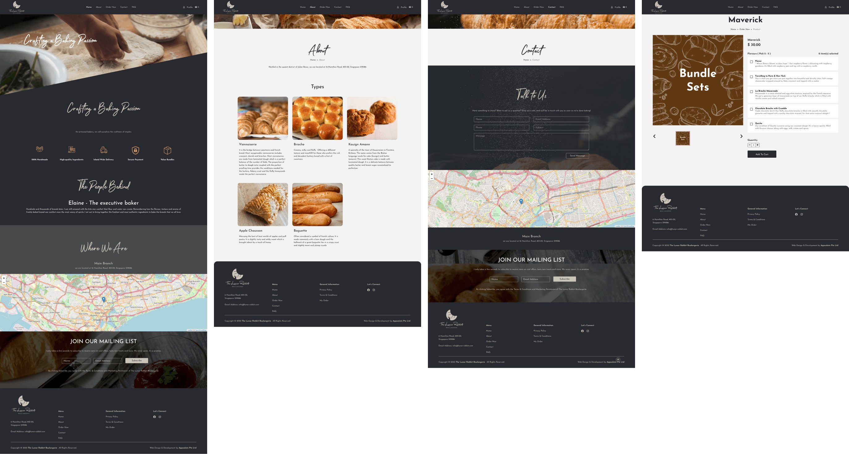
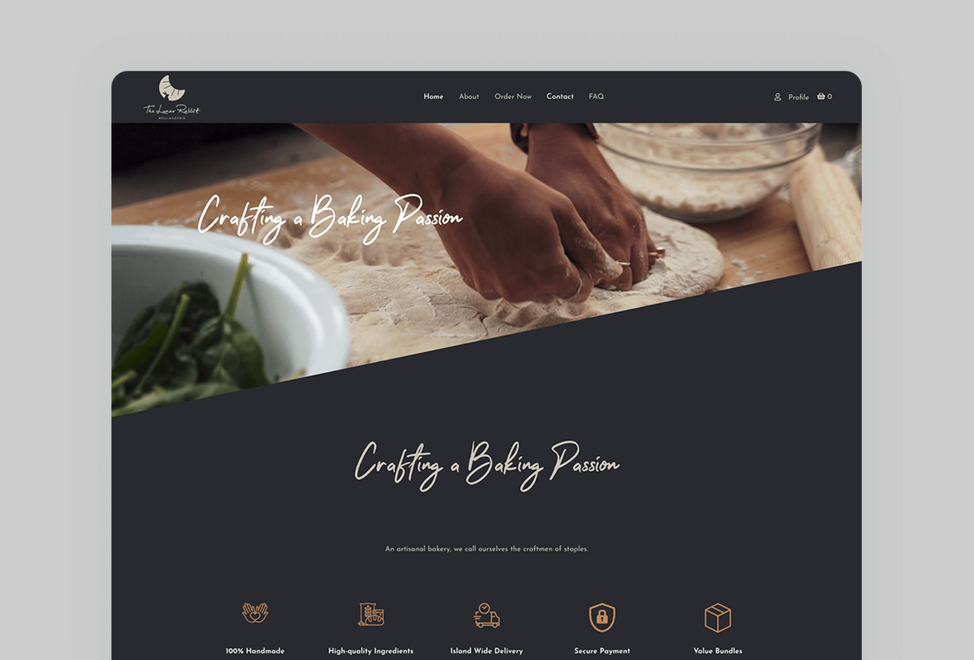
The bakery needs a new logo and an e-commerce website to sell their products online. The website should have a dark theme, classic look and feel, be tidy, and have a good user experience. The client also wants to have a subscription function to track customer behavior and offer promotions. The main goal of the project is to build a trendy e-commerce website for the bakery to sell their products online.
Ideate
The team brainstormed various design solutions that would meet the customer’s requirements of a dark theme, classic look and feel, tidy and user-friendly e-commerce website with a subscription function to track and provide promotions to customers.
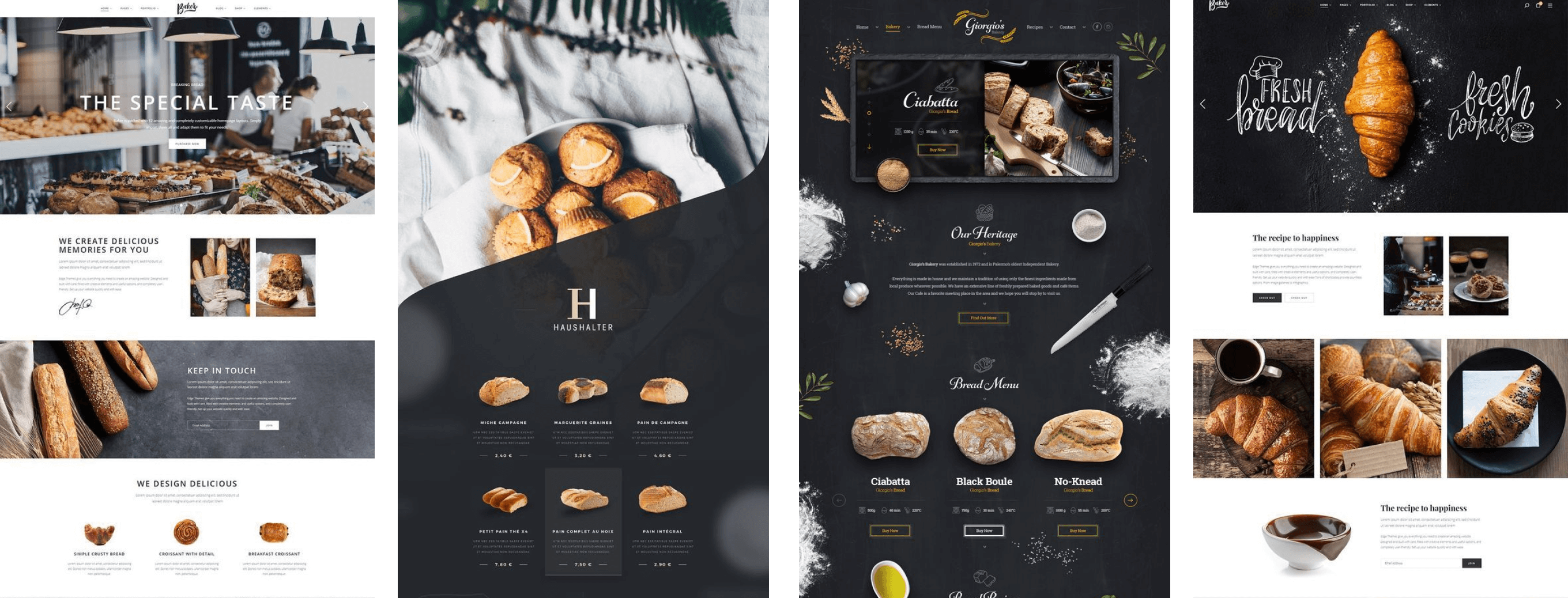
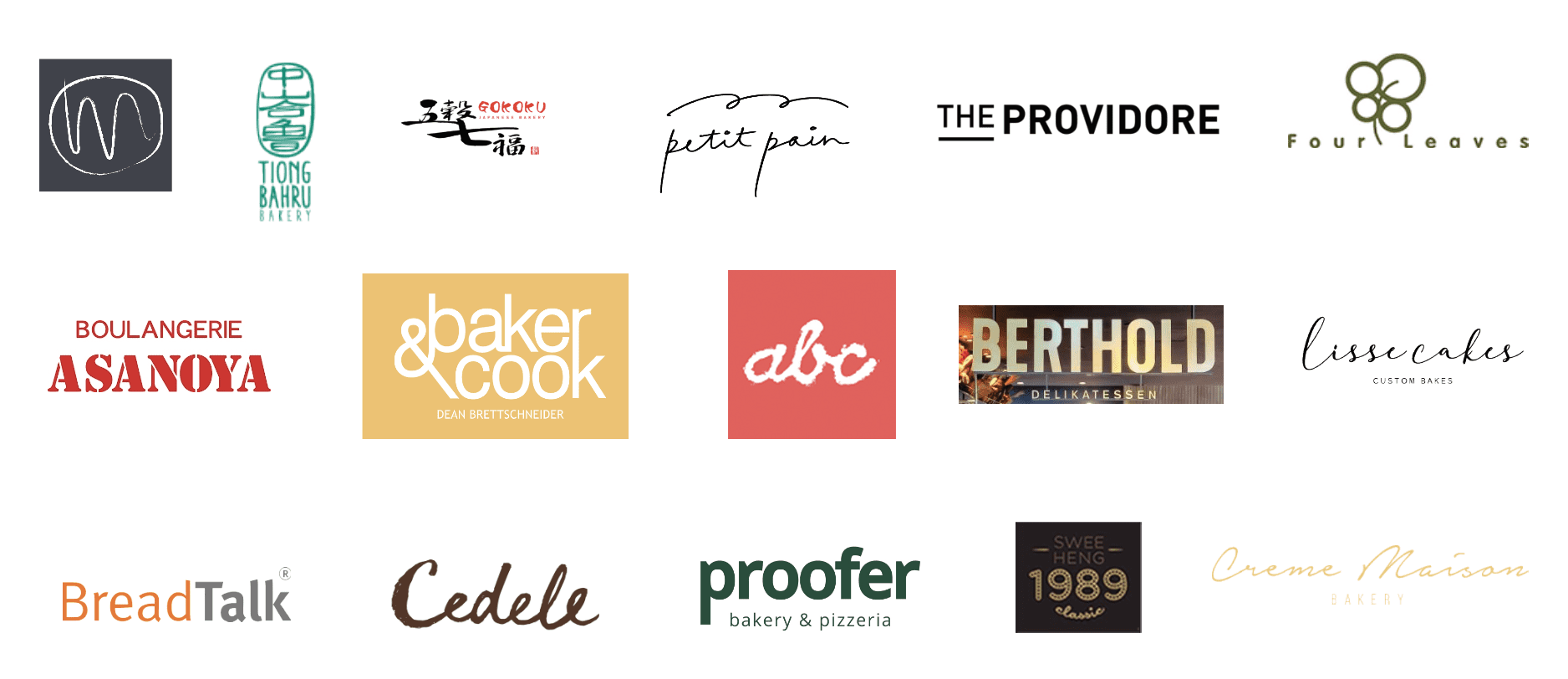
A competitive analysis is crucial in the design process for Lunar Rabbit Boulangerie’s e-commerce website. By comparing other bakery shops’ design, functionality, and features, we gain insights into industry standards and customer expectations. This informs our design decisions, ensuring the website is competitive and meets customer needs. Our analysis should consider website layout, product presentation, shopping cart functionality, customer reviews, and more. By understanding the strengths and weaknesses of other bakery websites, we can prioritize features and make informed trade-offs based on time and budget constraints. A thorough competitive analysis will result in a customer-centered design for Lunar Rabbit Boulangerie’s e-commerce website.
Wireframe and Prototype
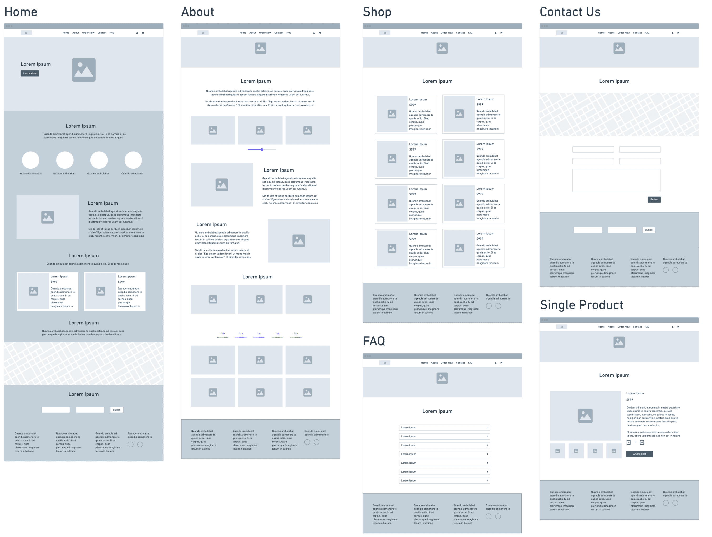
The team created low-fidelity prototypes to test design solutions with users. These prototypes tested different elements such as layout, navigation, and features to gather feedback and make informed decisions. This helped ensure the final design met user needs and expectations.
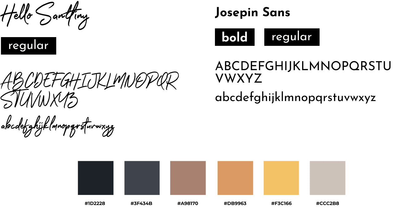
I chose Hello Santtiny and Josefin Sans as the website’s fonts for their legibility and brand relevance. The font creates a clear and user-friendly experience for all visitors. The color palette was also carefully selected to evoke emotions and establish a visual hierarchy on the website. This reinforces the brand identity and enhances the overall user experience for visitors.
User test
User testing was conducted to validate the design assumptions made during ideation and prototyping. I gathered feedback on the prototypes from internal team members, the client, and other stakeholders, and used it to refine and enhance the design. This helped ensure that the final product met the needs and expectations of all users.
Iterate
Based on the user feedback, I refined and improved the design. The process of ideating, prototyping, testing, and iterating was repeated until the solution met the needs of the users and provided value.
Launch
The final design solution was launched as the MVP (minimum viable product) and the team continued to collect user feedback to drive future improvements. The website offered a visually appealing and functional design solution that met the needs of the users and provided value to the business.
Key Takeaways
- The research was conducted to understand the latest trend and user needs when purchasing baked goods online.
- The website was designed with a dark theme to match the classic look and feel requested by the client and improved navigation for easy use.
- The website was tested with customers to ensure that it met their needs and expectations.
- The website was launched and received positive feedback from customers, resulting in increased purchases.
